PI Vision is a powerful tool for visualizing operational data, but its true potential is only unlocked through thoughtful design. A well-designed dashboard can transform complex data into clear, actionable insights, while a poorly designed one can lead to confusion and missed opportunities. The difference often comes down to a few key principles and practices.
Best Practices for PI Vision Dashboard Design
Before you start dragging and dropping elements, it’s crucial to understand the principles of effective dashboard design. These best practices will ensure your final product is not only visually appealing but also intuitive and valuable to your end-users.
1. Know Your Audience
The first rule of dashboard design is to know who you are designing for. A dashboard for a control room operator will look very different from one designed for a plant manager or a corporate executive. Ask yourself:
- Who will use this dashboard? (e.g., operators, engineers, managers)
- What are their primary goals? (e.g., monitoring real-time status, analyzing historical trends, tracking KPIs)
- What decisions will they make based on this data?
- What is their level of technical expertise?
Answering these questions will help you tailor the content, complexity, and layout to meet the specific needs of your audience, ensuring the dashboard is relevant and useful.
2. Define a Clear Purpose
Every dashboard should have a single, clear purpose. Trying to display too much unrelated information on one screen will only create clutter and dilute the core message. Determine the primary objective of your dashboard.
Is it to monitor the real-time health of a critical asset? Is it to compare production across different lines? Or is it to analyze the root cause of a recent downtime event? A focused purpose will guide your design choices and result in a more effective tool.
3. Keep It Simple and Clean
When it comes to data visualization, less is often more. A clean, uncluttered interface is easier to read and understand.
- Use whitespace effectively: Give your charts and tables room to breathe. Proper spacing improves readability and reduces cognitive load.
- Avoid visual noise: Eliminate any non-essential elements like excessive gridlines, borders, or decorative graphics. Every element on the screen should serve a purpose.
- Limit the number of colors: Use color purposefully to highlight important information or to distinguish between different data series. A limited, consistent color palette is easier on the eyes. For instance, use red only for critical alerts to ensure it grabs attention.
4. Organize Information Logically
Structure your dashboard in a way that makes sense to the user. Most people read from top-left to bottom-right, so place the most important, high-level information in the top-left corner. Group related information together and use headings or sections to create a clear visual hierarchy.
This logical flow allows users to scan the dashboard quickly and find the information they need without getting lost.
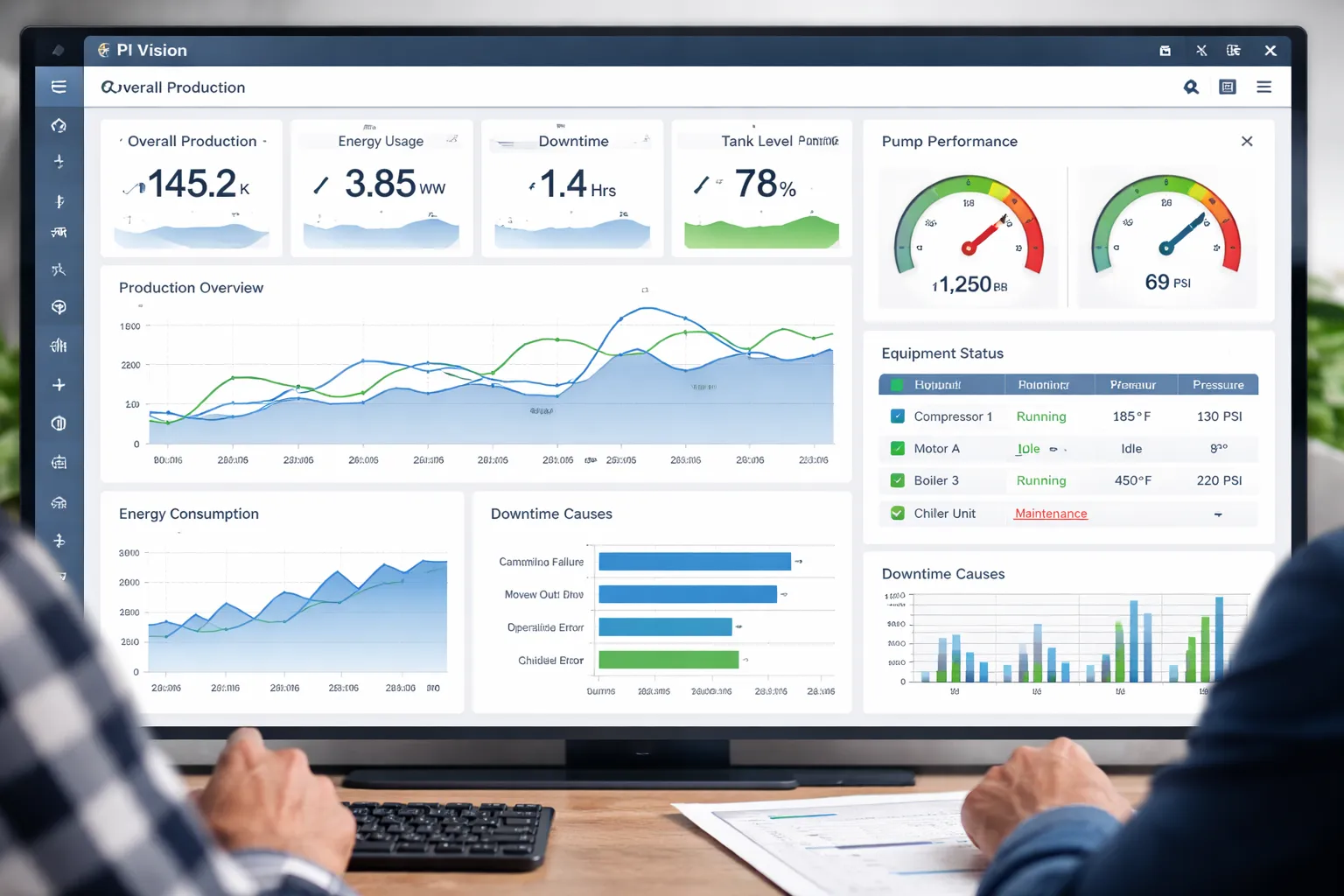
5. Choose the Right Visualizations
PI Vision offers a variety of symbols (charts, gauges, tables, etc.) to represent data. Choosing the right one is critical for conveying your message accurately.
- Line charts are excellent for showing trends over time.
- Bar charts are great for comparing values across different categories.
- Gauges and KPIs are perfect for displaying a single, critical metric against a target.
- Tables are useful for showing precise values and detailed information.
Avoid using complex charts like pie charts for more than a few categories, as they can be difficult to interpret. Select the visualization that best tells the story of your data.
Step-by-Step Guide to Creating a Dashboard

Now, let’s put these best practices into action. Here’s a simple guide to creating your first PI Vision dashboard.
Step 1: Create a New Display
Log in to PI Vision and click the “New Display” button from the home page. This will open a blank canvas where you can start building your dashboard.
Step 2: Search for Data Items
Use the search bar at the top to find the data you want to visualize. You can search for PI Points, AF attributes, or other data items from your AVEVA PI Historian. Simply type the name of the tag or attribute you’re looking for.
Step 3: Add and Configure Symbols
Once you’ve found your data, drag and drop it onto the canvas. PI Vision will automatically create a default visualization, usually a trend or a value symbol.
You can change this by selecting the symbol and choosing a different type from the right-hand pane. Configure the symbol by adjusting its settings, such as the time range for a trend or the min/max values for a gauge.
Step 4: Arrange Your Layout
Arrange the symbols on your canvas according to the logical flow you planned earlier. Resize and position them to create a clean and organized layout. Use the alignment and distribution tools to ensure your symbols are perfectly lined up.
Step 5: Enhance with Context
Add titles, labels, and units to your symbols to provide context. Use text boxes to add headings or explanatory notes. If you are displaying multiple trends, use a legend to clarify what each line represents. This context is essential for making the dashboard understandable to others.
Step 6: Save and Share
Once you are happy with your design, save the dashboard. Give it a descriptive name that reflects its purpose. You can then share it with your colleagues by sending them the link. Consider setting it as the home display for specific user groups if it’s a critical dashboard.
Tips for Optimizing Dashboard Performance

A dashboard is only useful if it loads quickly. Slow performance can frustrate users and lead to abandonment. Here are some tips to keep your PI Vision dashboards running smoothly.
- Limit the amount of data: Only display the data that is absolutely necessary. Avoid loading long time ranges or a large number of data points on the initial view. Use shorter default time ranges and allow users to zoom out if they need to see more historical data.
- Be mindful of complex calculations: While PI Asset Framework allows for powerful analyses, complex calculations can slow down dashboard loading times. Where possible, perform complex calculations on the server side and display the results, rather than calculating them on the fly in the dashboard.
- Use collections efficiently: Asset-relative displays and collections are powerful features, but they can be resource-intensive if not used carefully. Avoid creating overly large collections or nesting them too deeply.
- Regularly review and archive old dashboards: Over time, your PI Vision environment can become cluttered with old and unused dashboards. Regularly review your displays and archive or delete those that are no longer needed to keep the system clean and efficient.
Conclusion
Creating an effective PI Vision dashboard is both an art and a science. It requires a deep understanding of your audience, a clear purpose, and a commitment to simplicity and clarity. By following the best practices and steps outlined in this guide, you can design dashboards that not only look good but also provide meaningful, actionable insights.